How to design a product dashboard your users will love. (3 tips by Dataplayer).
An art form in itself, designing a dashboard is a symphony, combining instruments such as user psychology, data visualisation, and many more. Here are some lessons we at Dataplayer have learned with trial and error, and hope to continuously widen with time.
Show, don’t tell. – The philosophy behind the dashboard.
Raw data is messy, tiring for the eyes, and in many cases intangible.
It can be difficult to engage the user and make him part of the “story-telling” within the information you are trying to display.
When you show rather than tell, you make the user part of the experience. Instead of having everything simply imparted to him (which would be way too much data to absorb anyways), he sees it in his mind and comes to the conclusions you want.
But how do you show without telling?
Well, each offered data should serve a purpose.
Think about the last time you read a children’s picture book. It was probably quite engaging, foremost due to the fact that it was dealing with a reader with a very short attention span.
Easy words, sharp sentences, storyteller.
You needed to grasp your little audience from the first line, until the last page. Keep the same approach in mind when designing your dashboard. From the first widget, until the last, everything needs context and a purpose.
Order, Logic and Colors – Your success chant to unfold that philosophy.
When it comes to the way data will be visualised, these three elements are crucial. Let’s chant them together for an incredible UX, shall we?!
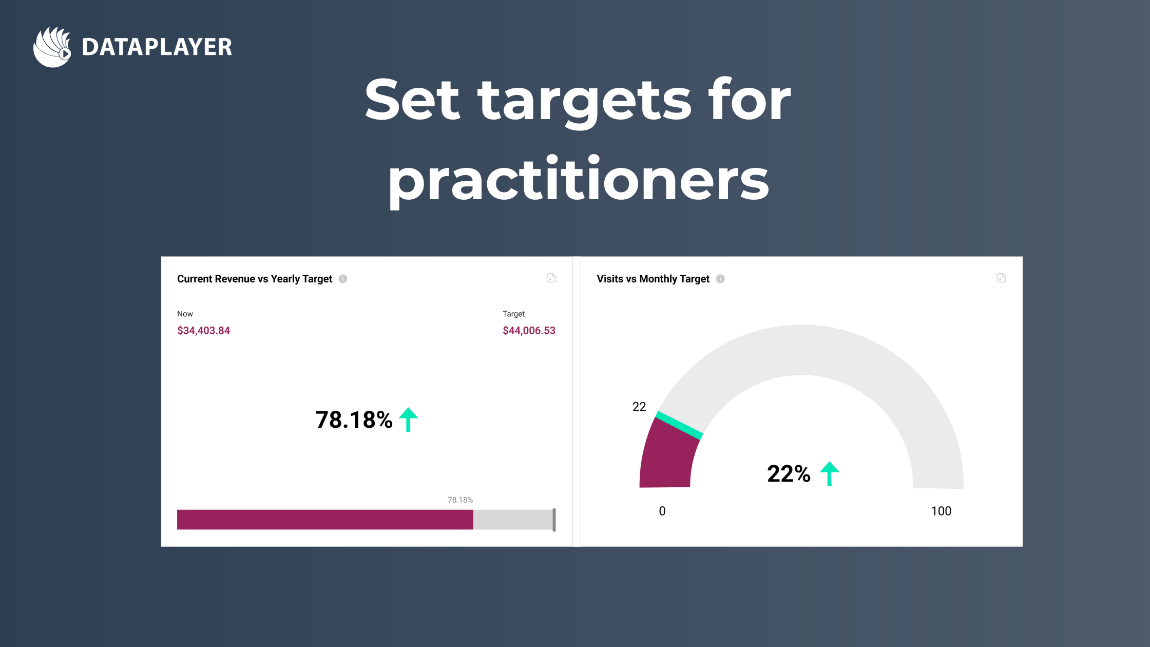
Order
Understandably, there needs to be a hierarchy when it comes to the way your information will flow. Make it clear to the user what’s important, their KPIs etc. need to be at the forefront.
Logic
Don’t crowd the dashboard with too many widgets, it’s paralysing. When using graphs, make sure that their structure is in correlation with what they are displaying.
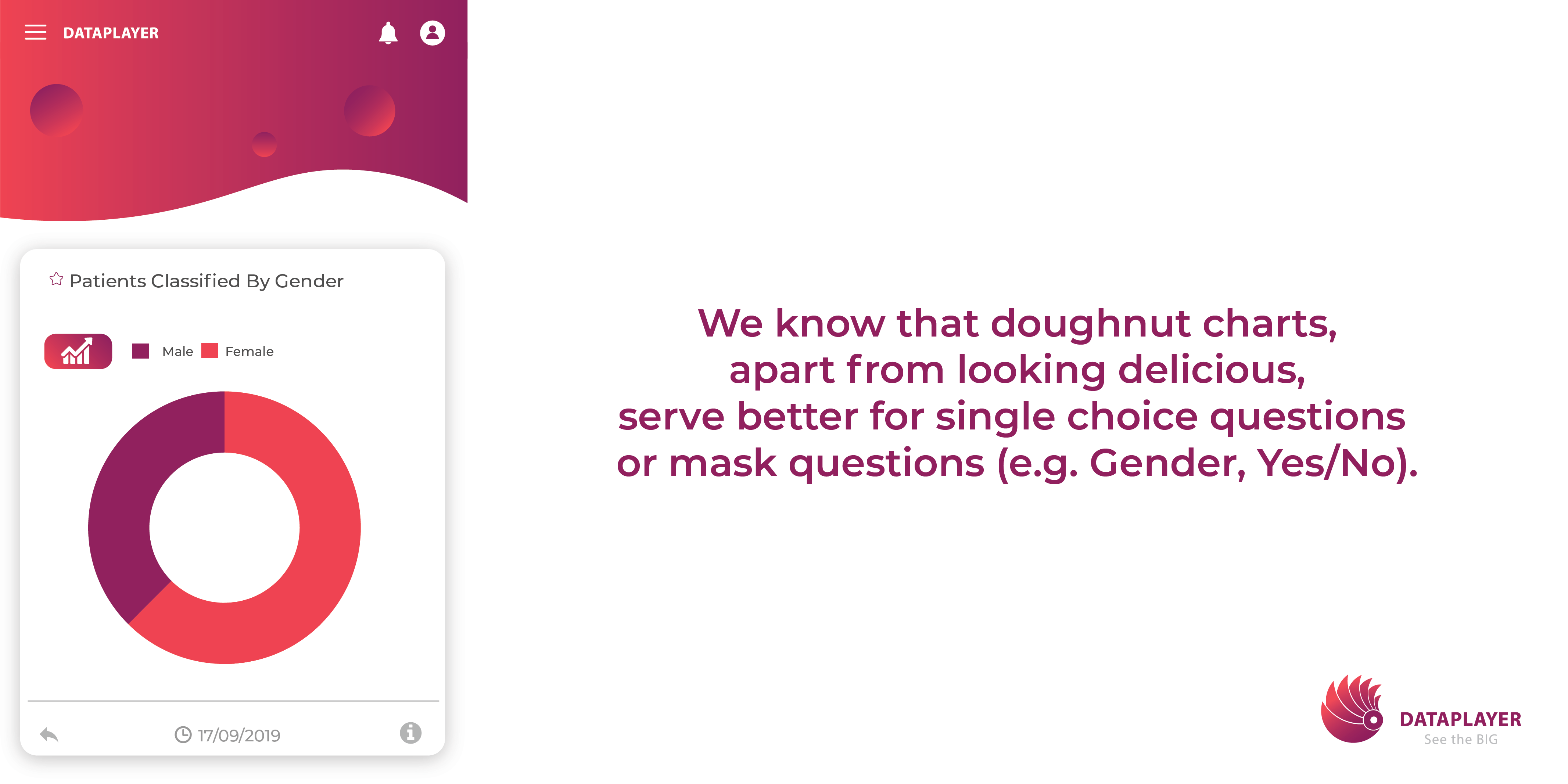
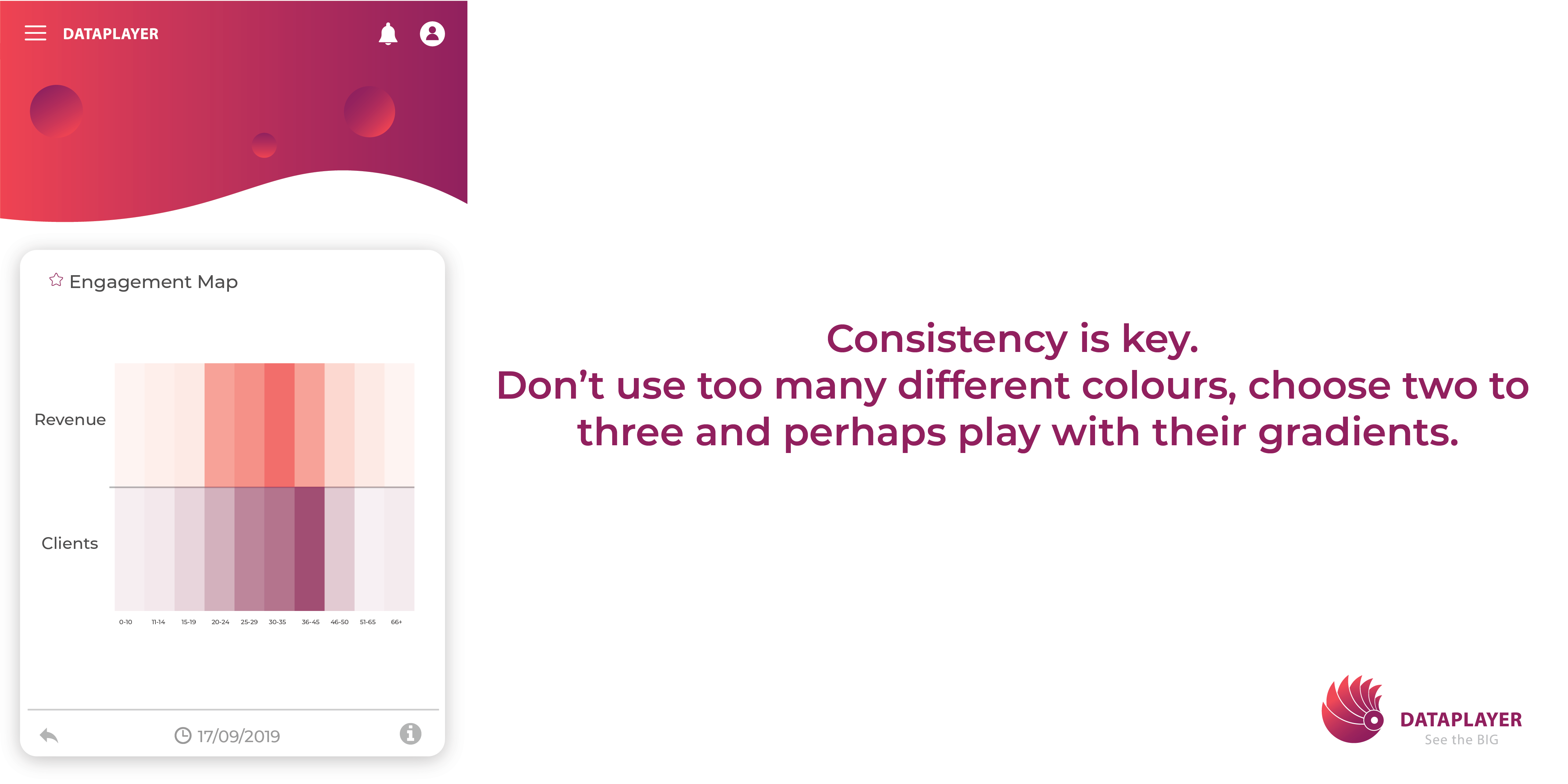
Colours and their impact
One common mistake is using intense and bold colours way too frequently. Even though they instantly draw users’ attention to a certain piece of data, if a dashboard contains only highly saturated colours, users may feel overwhelmed and lost. Where would they look at first?! A healthy balance of tones should do the trick.
Rely on constructive feedback. (Would you use it yourself ?)
Use it to improve your dashboard periodically. Check if your design is driving the behaviour you intended in the users and if everything is flowing in the right direction.
No one can give you a better answer to that than your target audience. However, it can all come down to a simple question, would you yourself want to use this application? What is valuable there, and what isn’t?!
All these questions can serve as mental nourishment for a continuous cycle of improvement.